Image Split Content
View example
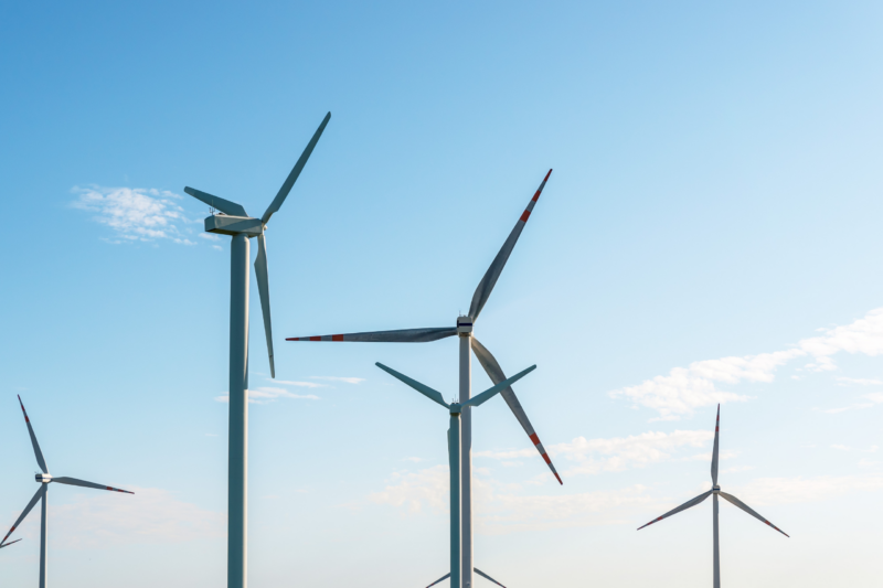
1. ESG & Sustainability Measurement
Transform internal and supply chain sustainability with our bespoke ESG reporting solution. Our cloud-based platform streamlines reporting, offering deep insights to guide decisions and align with your sustainability goals and KPIs.
There are no ACF fields assigned to this component.
@import "../../resources/scss/util/variables";
@import "../../resources/scss/util/mixins";

.block-image-split-content {
	padding: 0 0;
	height: auto;
	color: var(--text-color) !important;
	display: flex;
	align-items: center;
	flex-direction: column-reverse;

	min-height: 400px;

	@media (min-width: 1100px) and (max-height: 650px) {
		margin-top: 2rem;
		margin-bottom: 2rem
	}

	@include bp($lg){
		flex-direction: row;
		// min-height: 68vh;
		padding: 4rem 1rem;
	}

	&__wrapper{
		width: 100%;
	}

	&[data-image-alignment="left"]{
		.block-image-split-content__row{
			justify-content: flex-end;
		}

		.block-image-split-content__image-container{
			@include bp($lg){
				right: unset;
				left: 32px;
			}
		}

		.block-image-split-content__image-card{
			left: 24px;
			right: unset;

		}
	}

	&[data-border-bottom="1"]{
		border-bottom: solid 1px var(--text-color);
		overflow: hidden;
	}

	&[data-rounded-corners="1"]{
		border-radius: 32px;

		@include bp($lg){
			border-radius: 52px;
		}
	}

	&__content-wrapper{
		padding: 4rem 1rem;

		p{
			@include fluid-type(18, 22);
		}

		@include bp($lg){
			padding: 0 0;
			min-height: 52vh;
			display: flex;
			align-items: flex-start;
			flex-direction: column;
			justify-content: center;
		}
	}

	&__image-container{
		position: relative;
		right: unset;
		top: unset;
		transform: unset;
		width: 100%;
		border-radius: 0;
		overflow: hidden;
		display: flex;
		min-height: 400px;

		@include bp($lg){
			position: absolute;
			right: 32px;
			top: 50%;
			transform: translateY(-50%);
			width: 50%;
			border-radius: 52px;
			height: auto;
			max-height: 55vh;
		}

		img, picture{
			width: 100%;
			height: 100%;
			object-fit: cover;

		}
	}

	&__image-card{
		position: absolute;
		right: 24px;
		bottom: 24px;
		background: var(--white);
		border-radius: 52px;
		overflow: hidden;
		padding: 30px;
		color: var(--primary);
		width: calc(100% - 48px);

		&.mobile-ver{
			position: relative;
			left: unset !important;
			right: unset !important;
			bottom: unset;
			margin-top: 3rem;
			border: 1px solid rgba(56, 53, 81, 0.2);
			border-radius: 30px !important;
			width: 100%;
		}

		@include bp($sm){
			width: auto;
			padding: 30px 40px;
		}

		&-title{
			@include fluid-type(18,22);
			font-weight: 600;
		}

		&-items{
			display: flex;
			flex-direction: column;
			padding: 0;
			margin: 0;
			list-style: none;
			margin-top: 2.5rem;

			li{
				padding: 8px 0 8px 20px;
				border-top: solid 1px rgba(56,53,81,0.2);
				position: relative;
				color: var(--primary);

				a,span{
					@include fluid-type(16, 20);
				}

				a{
					color: var(--primary);
					&:hover{
						text-decoration: none;
					}
				}

				&::before{
					content: '';
					width: 14px;
					height: 14px;
					position: absolute;
					left: 0;
					top: 50%;
					transform: translateY(-50%);
					background-position: center;
					background-size: contain;
					background-repeat: no-repeat;
					background-image: url("data:image/svg+xml,%3Csvg width='9' height='18' viewBox='0 0 9 18' fill='none' xmlns='http://www.w3.org/2000/svg'%3E%3Cpath d='M0.15618 9.13477V0.649484L8.64146 9.13477L0.15618 17.62V9.13477Z' fill='%23F1A119'/%3E%3C/svg%3E%0A");

				}
			}
		}
	}

	&__secondary-cta{
		font-weight: 700;
		display: flex;
		flex-direction: row;
		align-items: center;
		gap: 0.5rem;
		text-decoration: none;
		text-transform: uppercase;

		&:hover{
			.ico{
				transform: translateX(10px);
				transition: .4s ease-out;
			}
		}

		.ico--arrow-right{
			transition: .6s ease-out;
			width: 24px;
			height: 24px;
			border: solid 1px var(--text-color);
			border-radius: 100px;
			background-position: center;
			background-repeat: no-repeat;
			background-size: 16px;
			background-image: url("data:image/svg+xml,%3Csvg width='28' height='18' viewBox='0 0 28 18' fill='none' xmlns='http://www.w3.org/2000/svg'%3E%3Cpath d='M20.3682 16.7598L26.7682 8.75977L20.3682 0.759765' stroke='%23383551'/%3E%3Cpath d='M26.7686 8.75977L0.768555 8.75977' stroke='%23383551'/%3E%3C/svg%3E%0A");
		}
	}

	&__heading{
		margin-bottom: 1.5rem;

		*{
			@include fluid-type(24, 32);
			font-weight: 600;
		}
	}

	&__content{
		margin-bottom: 3rem;

		p{
			&:last-child{
				margin-bottom: 0;
			}
		}
	}

	&__cta-container{
		display: flex;
		flex-direction: column;
		gap: 1.5rem;
		align-items: flex-start;

		@include bp($md){
			flex-direction: row;
			gap: 4rem;
			align-items: center;
		}
	}

	&.has-background{
		.ico--arrow-right{
			background-image: url("data:image/svg+xml,%3Csvg width='28' height='18' viewBox='0 0 28 18' fill='none' xmlns='http://www.w3.org/2000/svg'%3E%3Cpath d='M20.3682 16.7598L26.7682 8.75977L20.3682 0.759765' stroke='%23FFF'/%3E%3Cpath d='M26.7686 8.75977L0.768555 8.75977' stroke='%23FFF'/%3E%3C/svg%3E%0A");
		}

		.btn{
			color: var(--white);
		}
	}
}
There are is no JavaScript file with this component.
{
    "$schema": "https://schemas.wp.org/trunk/block.json",
    "apiVersion": 2,
    "name": "strategiq/image-split-content",
    "title": "Image Split Content",
    "description": "Example block to be used as a template",
    "category": "strategiq",
    "icon": "strategiq",
    "acf": {
        "mode": "preview",
        "renderTemplate": "block-image-split-content.php"
    },
    "supports": {
        "anchor": true,
        "align": false,
        "color": {
            "background": true,
            "text": false,
            "gradients": true
        },
        "spacing": {
            "padding": [
                "top",
                "bottom"
            ],
            "margin": [
                "top",
                "bottom"
            ]
        }
    },
    "example": {
        "attributes": {
            "mode": "preview",
            "data": {
                "heading_type": "h2",
                "heading_text": "Example - Example",
                "content": "This is some example content to represent what the content will look like"
            }
        }
    },
    "style": "file:../../assets/css/image-split-content/block-image-split-content.css"
}
Page Title
Page Type
Page URL
Supplier Development Training Programmes
page
Carbon Footprint Calculator
page
Company EDI Benchmark
page
Scope 3 Carbon Calculator
page
Supplier EDI Benchmark
page
Our Community Interest Company
page
Embodied Carbon Calculator
page
Sustainability Hubs
page
There are is no readme file with this component.